#MakeoverMonday 2020W21

This week's Makeover Monday looks at music industry sales over the past 40
years.
I had a feeling I had seen this topic before based on the picture in the
accompanying article. I then remembered seeing something similar on
Kevin Flerlage's 2019 Tableau Iron Viz
entry. You can view the other 2019 music-themed Iron Viz entries here.
Image in article

Reminded me of

Design and Inspiration
My first thought was to try a stream graph.
Kirti P recently posted an
example on the collapse of coal use in the United States, and a stream graph
showing the change in music format popularity would have made for a nice
update on the original.
However I decided to take a different approach. I had browsed the Information is Beautiful Awards site recently and came
across
this infographic
I had bookmarked as inspiration. It's a radial chart with a bar chart, shaped
like a 'b', or for my example a musical note.
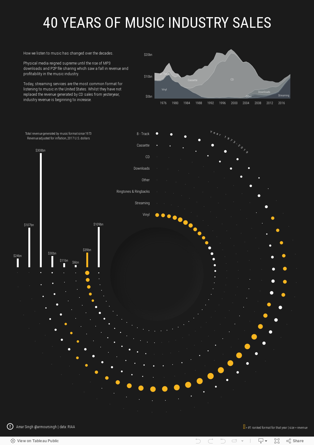
The viz
The viz is made up of three worksheets
- An area graph showing the revenue generated by [grouped] music format over time (as per original)
- A radial chart showing music formats (grouped together, see below) over time
- A bar chart showing total revenue for the music formats since 1973
Grouping the data
There are 23 music formats supplied in the data but these can be grouped
together. The grouping I have used is below but may not be 100% correct.

Amending the Value field
The [Value (Actual)] field is provided in units of a thousand million and I wanted it
to be in billions.
Therefore the following calculated field was used.

Area Chart
When constructing the area chart, be careful to select only one option in
the [Metric] field. I used 'Value (Adjusted)' as this provides an
inflation-adjusted value based on 2017 U.S. dollars.
I didn't want to have too many colours on the area chart so I used a range
of greys with orange for the Streaming group.

Radial Chart
For the radial chart I followed
this tutorial by Toan Hoang. I won't go into detail on the steps as the tutorial is easy to follow but I
had to make a couple adjustments to get the chart to look the way I wanted.
- I used the [Format (group)] field in place of the [Order Date] field in the tutorial
- Because I needed the radial chart to stop at a certain position to allow me to use a bar chart, I amended the [Multiplier] calculated field to 360/61.3
- I created a [Rank] field to rank each format by its revenue generated. I wanted the #1 rank to be coloured in orange and the rest to be white
- The circles were sized by the [Value in Bn] field
The X and Y fields were calculated across the following options

Result

Bar Chart
The bar chart shows the total revenue generated by each music format since
1973.
The Streaming group value was coloured in orange and the rest white. This is
solely because Streaming was ranked #1 in the radial chart and coloured
orange in the area chart, and I wanted consistency.

Grouping worksheet
Finally, I created a worksheet to add into an information icon tooltip showing how
the formats were grouped together. If this is incorrect, please get in touch
via Twitter and let me know.

Putting it all together
The dashboard was put together using floating containers as I had to move the
bar chart over the radial chart and align it carefully over the circles for
the corresponding formats.
The dented circle in the middle was created using
Figma and
neumorphism.io. I thought it added a subtle element to the viz.
Final output
You can interact with the viz below or view on my
Tableau Public
profile.