#MakeoverMonday 2020W22
This week, Operation Fistula (as part of the #Viz5 initiative) provided a dataset that looks at female genital mutilation (FGM) in Tanzania.
What is Viz5?
The ultimate goal of Viz5 is to create a space where data advocacy and
insights meet impact.
This work seeks to ignite a data advocacy effort with the power to not only
raise awareness of
extreme gender inequality, but also catalyze global action to end it. Viz5
is led by Operation Fistula, with #MakeoverMonday and Tableau Foundation
operating as critical partners.
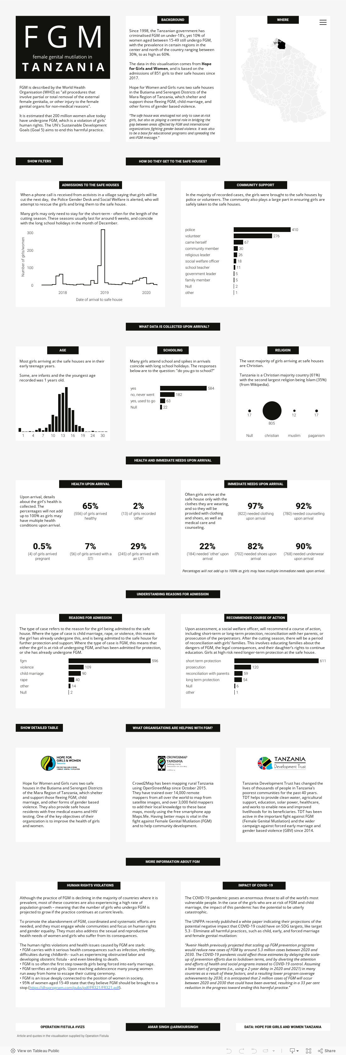
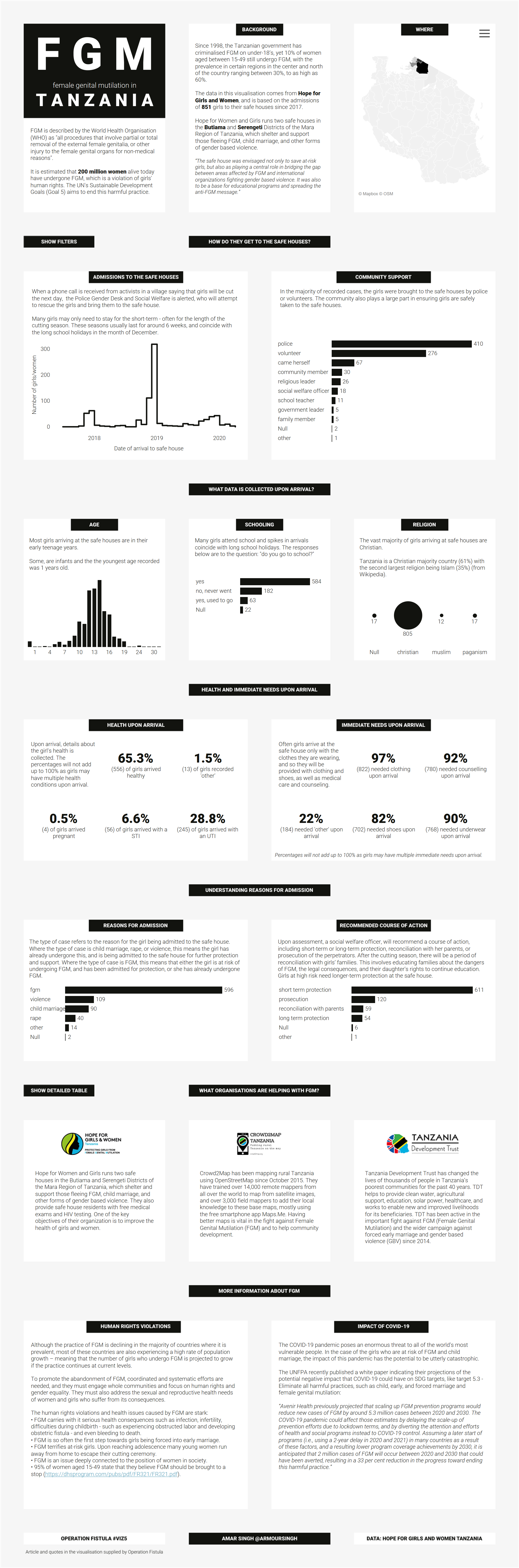
FGM in Tanzania
The theme for this month's (and this week's) Viz5 initiative was FGM. The
World Health Organisation describes FGM as “all procedures that involve
partial or total removal of the external female genitalia, or other injury to
the female genital organs for non-medical reasons".
In Tanzania, approximately 10% of women aged 15 to 49 report having
undergone FGM, but prevalence is much higher in the Mara region at 32%. The
prevalence of FGM varies greatly by ethnic identity and within Tanzania these
procedures are predominantly performed as a component of girls’ social
initiation. Some groups, such as Kuria and Maasai people, have historically
performed these procedures, while most others have not.
Hope for Girls and Women
runs two safe houses in the Butiama and Serengeti Districts of the Mara Region
of Tanzania, which shelter and support those fleeing FGM, child marriage, and
other forms of gender based violence. You can read more about this month's
Viz5 and download the supporting data and documentation
here.
Original viz

The original viz supplied was fairly simple in its analysis.
What I liked
- It's clear FGM is the largest reason why girls/women are admitted to the safe houses
- I can see there is a spike in cases around the end of the year
- It's clear that there is an immediate need for clothing when the girls/women arrive at the safe houses
What could be improved
- More context to the background of FGM and situation in Tanzania
- Pie chart has five sections, an alternative viz would be better
- Labels can be added to the bar chart as well as an explanation saying multiple needs may exist per individual on arrival
- A narrative explaining each visualisation would help provide more context
The approach
I wanted to take a more simple approach this week and focus more on
storytelling. It's an area I'm sure we can all become better at.
I drew out a skeleton for the story that went
- What is FGM?
- The background of FGM and the initiative(s) in Tanzania
- How do girls/women arrive at safe houses?
- Who are they?
- What do we know about them?
- What support do they need and what are the recommendations?
- What organisations are involved?
Background
The background image was created in Figma.
I wanted each part of the viz to have its own space and I wanted them to be
spaced out. Admittedly there was a lot of going back and forth with Tableau
and Figma as I built the visualisations, as some needed more space than I
had initially allocated and some needed less.

The map
I used the supplied spatial file to join to the dataset to produce the map.

Spatial files come with a field called 'Geometry'. Drag the 'Geometry' field
into the Details pane to render the map.
Other visualisations
I kept all other visualisations simple with bar charts or line charts for
fear of losing emphasis on the story.
The text was taken from the supplied document in the dataset and I added
some commentary based on the insights generated.
A table was added to show the details of all 851 girls/women recorded in the
dataset. As you can see, it was difficult to put all the fields into the
space I had on the dashboard so the headings for the measures are not
readable. This viz was placed into a container and hidden using a show hide
button.

Finally, I added a filter menu and a table to provide an alternative view of
locations than the map.

You can interact with the viz below or view on my Tableau Public profile.