#ProjectHealthViz - May 2020

The
dataset
provided looked into the 5 year stock price history for a company called
Teledoc Health Inc.


Then amend the tooltip.


I had wanted to try using Set Actions for a while, particularly after seeing
some great examples in the Tableau Community by
Samuel Parsons,
Andy Kriebel
and
Rahul Singh, and this dataset provided a great opportunity to do so.
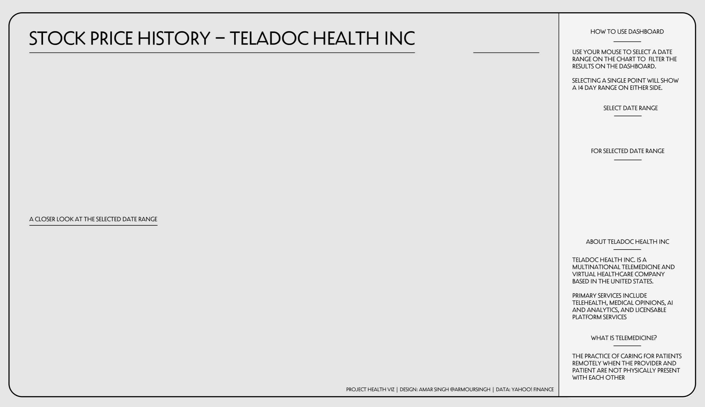
Creating the background
The background was created using
Figma. Figma is a in-browser
interface design application which can be likened to Adobe
Illustrator.
It was a simple background created using a rectangle with rounded corners
and a side panel. The font is Decovar Alpha which has slowly become one of
my favoured fonts, though sadly this is not a font that is rendered on
Tableau Public.
Creating the calculated fields
The dashboard uses a number of calculated fields to determine dates and
prices.
Date Set: right click
on Date, click 'Create' then 'Set'.
Date Range: create a
parameter with the following options:
- All
- 7D
- 1M
- 3M
- 6M
- 12M
- 2Y
- 3Y
Maximum Date: returns the
maximum date from the Set
{ MAX(IF [Date set] THEN
[Date] END) }
Maximum Date (single selection): adds 14 days to the selected date in the Set
{ MAX(IF [Date set] THEN [Date]+14 END) }
Max Date: returns the
max date depending on whether the Set contains one value (single selection)
or multiple
IF ([Minimum Date] = [Maximum Date]) THEN [Maximum Date (single selection)]
ELSE [Maximum Date]
END
Minimum Date: returns the
minimum date from the Set
{ MIN(IF [Date set] THEN [Date] END) }
Minimum Date (single selection): subtracts 14 days to the selected date in the Set
{ MIN(IF [Date set] THEN [Date]-14 END) }
Min Date: returns the
min date depending on whether the Set contains one value (single selection)
or multiple
IF ([Minimum Date] = [Maximum Date]) THEN [Minimum Date (single selection)]
ELSE [Minimum Date]
END
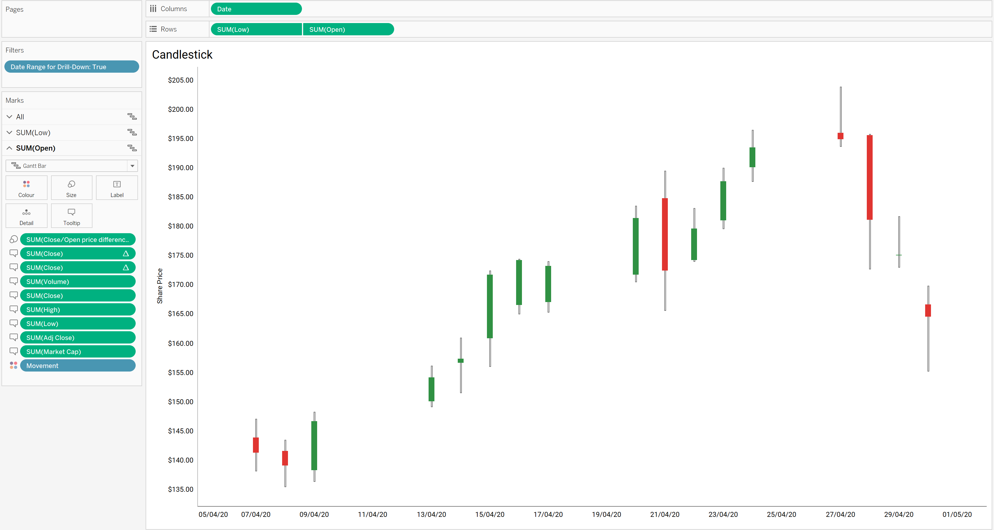
Movement: checks
whether the closing price is greater than the opening price. This is used to
colour the candlestick chart
[Close]>[Open]
Visible Date Range: allows you to specify the date range for the line chart
CASE [Date Range]
WHEN 'All' THEN [Date]
WHEN '7D' THEN IF [Date]>{MAX(DATEADD('day',-7,[Date]))} THEN [Date]
END
WHEN '1M' THEN IF [Date]>{MAX(DATEADD('month',-1,[Date]))} THEN [Date]
END
WHEN '3M' THEN IF [Date]>{MAX(DATEADD('month',-3,[Date]))} THEN [Date]
END
WHEN '6M' THEN IF [Date]>{MAX(DATEADD('month',-6,[Date]))} THEN [Date]
END
WHEN '12M' THEN IF [Date]>{MAX(DATEADD('month',-12,[Date]))} THEN
[Date] END
WHEN '2Y' THEN IF [Date]>{MAX(DATEADD('year',-2,[Date]))} THEN [Date]
END
WHEN '3Y' THEN IF [Date]>{MAX(DATEADD('year',-3,[Date]))} THEN [Date]
END
END
Date Range for Drill-Down: filters the date range for the candlestick chart
IF ([Minimum Date] = [Maximum Date])
THEN
[Date]>[Minimum Date (single selection)] AND [Date]<[Maximum Date
(single selection)]
ELSE [Date]>[Minimum Date] AND [Date]<[Maximum Date]
END
Avg. Close Price
AVG([Close])
Close/Open price difference
[Close]-[Open]
Current Market Cap: the
market capitalisation irrespective of the date filters
{ FIXED : MAX(IF [Date] = { FIXED : MAX([Date]) } THEN
[Close]*[Volume] END ) }
Current Price: the
current share price irrespective of the date filters
{ FIXED : MAX( IF [Date] = { FIXED : MAX([Date]) } THEN [Close] END )
}
Current Price Change: the change in the current share price vs the day before,
irrespective of the date filters
{ FIXED : MAX( IF [Date] = { FIXED : MAX([Date]) } THEN [Close] END ) }
-
{ FIXED : MAX( IF [Date] = { FIXED : MAX([Date]-1) } THEN [Close] END ) }
High/Low price difference
[High]-[Low]
Market Cap
[Close] * [Volume]
Max. Closing Price
MAX([Close])
Min. Closing Price
MIN([Close])
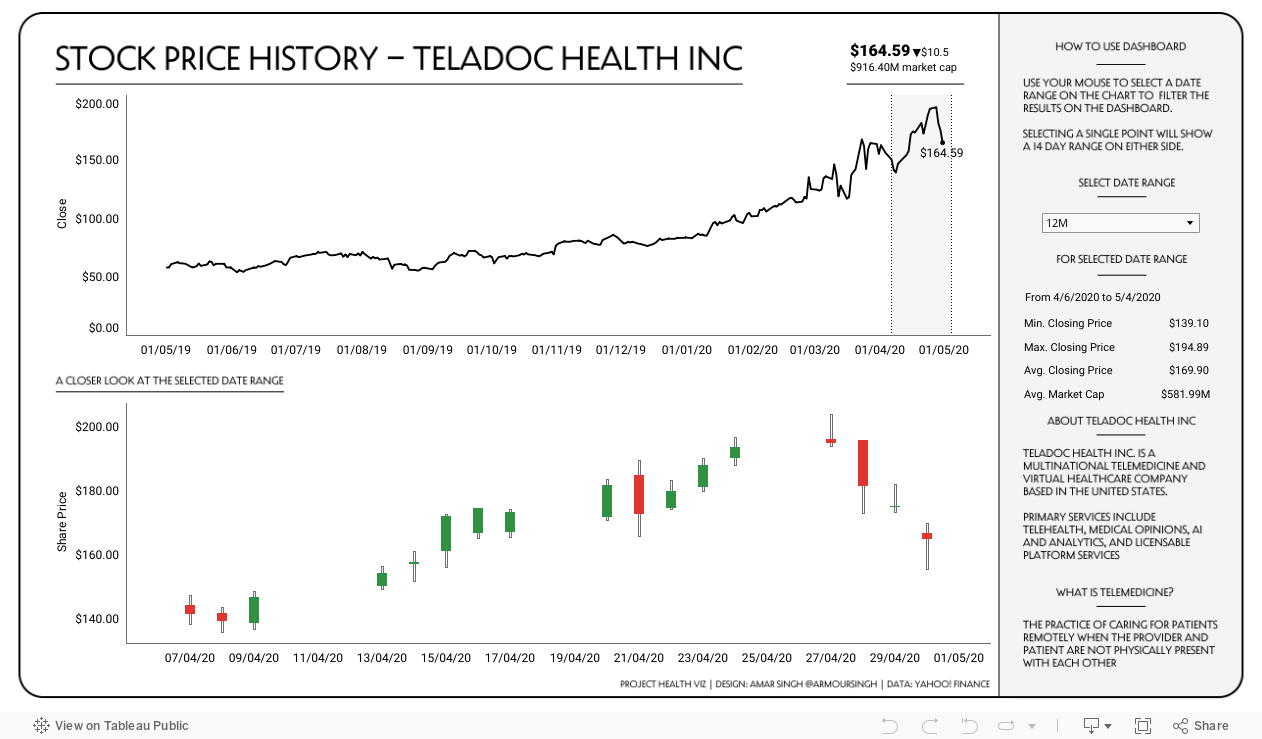
Creating the Line Chart
Add [Date] to Columns and [Close] to Rows.
The label is set to show the most recent label.
Add a reference line (band) for the min and max dates.
Create the Candlestick chart
The candlestick chart is made up of two Gantt Bars on a dual axis.
The first axis shows a thin line for the high and low traded prices. Drag [Low]
to the Rows pane and use the [High/Low price difference] field to size the Gantt
Bar.
The second axis shows the open and close price. Drag [Open] to the
Rows pane, select dual axis
then synchronise the axis. Put the [Close/Open price difference] field into
the Size mark and place
[Movement] into the
Colour mark. Amend
colours to show True as green and False as
red.
Finally add the [Date Range for Drill-Down] field to the filter pane and
amend the tooltip.
Creating the dashboard
I positioned the two charts in the spaces I had allocated for them on the
background image. Three additional worksheets were created to show the
latest share price, the selected date range and prices for the selected date
range.
Set Action
One Set Action was created which updates the Set based on a selection on the
line chart. This then updates the Candlestick chart and the two worksheets
sitting on the sidebar.
You can interact with the final viz below or
view on my Tableau Public profile.
If you choose to create your own viz for May's #ProjectHealthViz, share it
on
Twitter
using the hashtag and submit it on the
submission tracker.