#MakeoverMonday 2020W23

This week's
Makeover Monday
looked at survey data for people in Great Britain, in response to the question
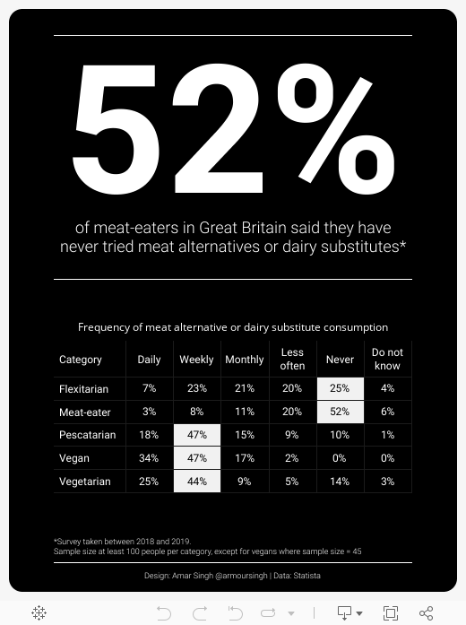
How frequently, if at all, do you consume specifically meat-free or animal-free products such as meat alternatives or dairy substitutes?
The dataset was fairly simple and the original viz was a stacked bar chart, a firm favourite in the data viz community (I'm kidding...).
Original viz

Stacked bar charts aren't great because you lose the baseline after the first component of the stack, making it difficult to compare sections.
I thought a BAN would be the right way to draw out some insights from the data
which showed that 52% of meat-eaters had never tried any meat or dairy
alternatives.
The viz
Tableau only lets you have text size of 72, so if you want something bigger
you'll need to use another application for the text element.
I added some text at the bottom of the viz detailing the survey period and the sample sizes given they were not consistent across all categories.
Finally, I changed the default formatting of the measure to percent with 0 decimal
places and created a table. The colours are ranked using a table calculation
and I wanted to highlight the highest percentage per category.
You can interact with the viz below or
view on my Tableau Public profile.