#MakeoverMonday 2020W20
Fun fact, the insurance for my first car was £2,200. Thankfully it went down significantly over the years...
The original viz was a type of radial chart and it reminded me of
this viz
by Pablo Gomez on how much money big companies make per second.
Original

Reminded me of
I had considered doing something similar but having played with Set Actions
for the recent
Workout Wednesday, I wanted to make something a bit more interactive.
Design
The colour palette came from
this
image I saw on Pinterest. I've recently created an account after seeing the
Pinterest collections by
Judit Bekker
and
Evelina Judeikytė
in the Tableau community. I would recommend creating an account and saving
anything you like as sources for inspiration in future as this is now
helping me widen my thinking in terms of how to make more impact with my
visualisations.
Although I used Figma to create the background, it could have been created
in Tableau using containers and blank sheets.
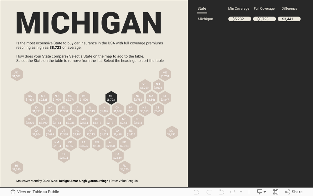
I wanted to have 2 things
- A map to allow the user to select States and add them to a list
- A table which showed the minimum and full coverage prices, along with the differences
Background image

First challenge
Because the dataset contained Alaska and Hawaii, it meant the map looked
bigger than I wanted. So I changed it to a hex map.

Hex Map
I already had a hex map file saved to my PC but you can download one and
see a tutorial
here. This was joined to the original dataset. As you can see from the image,
the way the data is joined in Tableau 2020.2 is different from previous
versions. This was a simple join so I have not had the chance to play
around with the new data model, but you can read more about it
on Ken Flerlage's blog post.
In my hex map file I had to change 'District of Columbia' to 'Washington
D.C.' to match the original dataset, otherwise I encountered a null value
for one of the tiles.

The below image shows the hex map worksheet. At this stage the size of the
shapes are not important but they will play a big factor on the main
dashboard. To understand why sizing is important for hex maps, please read
point 3 on Kevin Flerlage's brilliant blog post
Simple Steps to Better Design
- actually read the whole thing as there is so much good content to
digest!

Table
The table would store the selected States from the Set and show the
minimum and full coverage values, as well as the difference. I wanted the
table to be a bit more visual and remembered seeing rounded bars behind
numbers in
Ludovic Tavernier's
Modern Sales Dashboard which I had previously reverse engineered (as I bet did many!) when
first released.
To create the rounded bar you need to have 3 measures - I created them in
the pane but you can create calculated fields for them.
- MIN(-1.0)
- MIN(0)
- MIN(1)
That's it.
Set the Mark to a Line and use Measure Names on Path. Remove all
formatting.

Then duplicate the pill twice by selecting Ctrl and clicking and dragging
the Measure Values pill on the Columns pane next to itself. This then
creates three pills for the three measures I want to show. Unfortunately
you'll need to amend the formatting again but you can wait to do that
after the three pills are on the worksheet.

Dashboard actions
The dashboard actions are the same as per the
#WOW2020 W20
challenge. You add values to a Set by selecting the State from the hex
map, and remove them by selecting a State on the table.
Add

Remove

First output
The below .gif shows the Set Actions in action (no pun intended).

Responding to feedback
After publishing the viz,
Sean Miller provided
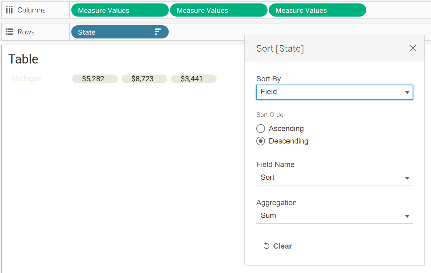
some great feedback on adding an option to let people sort the table.
To do this I had to do two things
- Create a parameter with the options to sort the table
- Minimum Coverage (descending order)
- Full Coverage (descending order)
- Different (descending order)
- State (A-Z)
- Create a new data file that would allow me to create a worksheet for filtering
The idea was that the user would select a heading to sort by and a line
would appear underneath the label to show it had been selected.
The steps I took are below.
Excel file

Formula for sorting the table based on the Parameter.

On the table, sort the State field using the newly created Sort field
Sort options worksheet. This is a new worksheet using the newly created
Excel datasource.

Formula to show which option was selected (using the new data source)

Bars to show which option was selected (new worksheet using the new data
source)

It was a bit tricky to add to the dashboard due to how far apart the State
and other other labels were from each other, so I had to duplicate the
sheets and filter accordingly.
The final step was to add a dashboard action to update the Sort parameter.

To prevent anyone from accidentally selecting the numbers on the table, I
added a blank sheet over them.
Final result
You can interact with the dashboard below or
view
on my Tableau Public profile.